Volatility Surface
Strike × DTE × IV in one view, plus skew and term comparisons
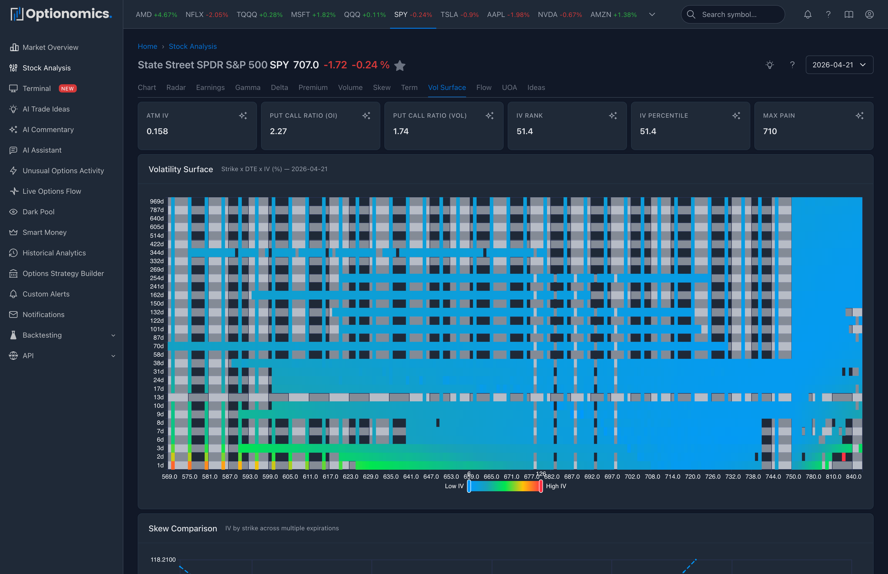
What this chart answers
Skew shows how implied vol changes across strikes for one expiry. Term Structure shows how implied vol changes across expiries at one strike (typically ATM). The Volatility Surface stacks both at once: a heatmap of implied vol across every strike and every expiration for the symbol on the chosen date.
Once you can see the surface as a whole, questions you previously had to ask one chart at a time become obvious in a single look:
- Is the entire surface elevated, or just front-month?
- Is downside priced hotter than upside everywhere, or only in some expiries?
- Where is the most expensive option on this name today?
- Where is the cheapest tail?
Availability: All plans (Delta and higher)
Open it: From any stock page, choose Vol Surface from the daily-analytics tab bar.
What you’ll see on the page
The page has three coordinated views built from the same chain snapshot:
1. Volatility Surface heatmap
A heatmap with strike on one axis, DTE on the other, and the implied volatility (%) of each strike-expiry cell as the color. Hot cells mean expensive options; cold cells mean cheap options.
Reading tips:
- Vertical streaks (one strike that’s hot across many expiries) often correspond to a wing people are paying up for.
- Horizontal streaks (one expiry that’s hot across many strikes) often correspond to a dated event—earnings, FDA, Fed, expiry-week effects.
- A surface that flattens with DTE is normal; one that steepens unusually warrants a closer look at term structure.
2. Skew Comparison across expirations
A line chart with IV by strike drawn for multiple expirations at once. This is how you tell whether the smile / smirk is the same shape across the curve or whether near-term and far-term are telling different stories. A near-term smile that is dramatically steeper than the far-term often hints at near-term event pricing.
3. Term Structure by Delta
A line chart of IV across expirations at three reference points: 25-delta put, ATM, and 25-delta call. This separates the term structure of risk from the term structure of carry:
- A normal market typically has a gentle upward slope (contango) at all three lines.
- Backwardation in the 25-delta put line often shows up before front-end downside protection is in demand.
- A kink at one specific expiry across all three lines is the classic shape of a dated event.
How to use it in your workflow
- Open the heatmap first for a global feel of where the surface sits today.
- Compare to skew across expirations if a particular strike or wing looks unusual.
- Use term-by-delta to see whether the front end is paying for a specific event vs a regime shift.
- Time Travel with the date selector—run today vs a week ago to see how the surface migrated with price and time.
For tighter, single-expiry questions, jump back to Volatility Skew or Term Structure.
Important context
- Implied volatility is a market-implied quantity for each contract; thinly traded strikes can show noisy values that you should discount visually.
- Surfaces near earnings or other binary events look distorted on purpose—the option market is pricing a known event into a window.
- The surface for a date is built from a snapshot of the option chain, not a tick-by-tick replay.
Remember: The surface tells you how the market is pricing risk now, not where realized vol will end up. Use it as one input next to flow, positioning, and your own thesis.
Related: